Art, the universal language, can transcend space and time to reach a diverse audience. We hear this all the time, but do we truly feel the weight of these words? A cloud of elitism envelops the “art world,” alienating the perspectives of some while glorifying those of others. In efforts to challenge ideas that reinforce the intrinsic validity of one individual’s take on art over another’s, columnist Lisa Aubry will explore different creative spaces and outlooks on art and reconcile the fields of arts and sciences through discussions.
Untamed shrubbery once peppered the rolling terrain that would later transform into the UCLA campus.
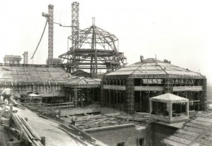
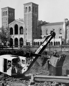
By 1929, the school’s first four structures had cropped up on the hilly region’s highest point. The buildings were originally called Royce Hall, the College Library (Powell Library), the Chemistry Building (Haines Hall) and the Physics-Biology Building (Kaplan Hall). While much more than their titles have changed in the following nine decades, these core buildings unequivocally remain the heart and pride of the campus’ architecture – their symbolic motifs and stylistic inspirations communicate the values of academia.
UCLA began as the southern branch of UC Berkeley but later broke away to become a self-contained university in its own right. The school’s desire to differentiate itself from UC Berkeley in its stylistic expression is strongly reflected in its architecture, said classics associate professor Robert Gurval. Rather than subscribing to a Gothic style like most American universities, UCLA actively aimed to embody Southern California’s distinctive luminosity and climate, Gurval said. Two architectural teams emulated styles from northern Italy and Spain, coastal regions that they found fit better into Southern California’s visual repertoire than did structures from colder northern European countries.
Although the campus’ first architects allotted priority to constructing functional, sturdy structures, practicality is not mutually exclusive with decorative or playful touches, Gurval said. Royce Hall, dedicated to classrooms and administrative offices, was positioned facing east to maximize sunlight. When the sunbeams strike the building’s asymmetrically designed towers, the bricks simmer in multicolor reds and oranges. Playing off the university’s motto, “Let there be light,” architectural firm Allison & Allison inlaid 50 different hues of red-colored bricks with the dazzling effects in mind.
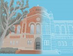
During a tour of Royce Hall, graduate archaeology student Amr Shahat and second-year history student Catherine Colson pointed out the many art forms encrusted in its surface, as well as more subtly articulated within. Modeled after the Basilica di Sant’Ambrogio in Milan, Royce Hall was meant to serve as a “cathedral to the humanities,” Shahat said. The cross-vaulted ceilings under the colonnade feature frescos representing 12 academic fields. A person holding an abacus signifies mathematics, while a person looking into a human skull indicates philosophy.
[RELATED: UCLA opens centennial celebration with Alumni Day festivities]
Powell Library’s red brickwork and triad of massive windows echo Royce’s bricks and triple portal entrances that open onto the plaza. Graham Smith, a second-year environmental science student who conducted a walk-through tour of Powell Library, said architect George W. Kelham modeled the stone entrance after that of the Basilica di San Zeno in Verona, Italy. Intended as a “temple to books and to the written word,” Powell pulled from an architectural vocabulary of religious structures, replacing Christian symbols with mythic and secular ones. For instance, San Zeno’s Christ figure is replaced with an owl, which represents Minerva, the Roman goddess of wisdom and learning.

Powell’s interior teems with colorful Moorish-inspired tile work and animal imagery. The geometrical wall niche at the center of the stairway is an element appropriated from mosque architecture known as a mihrab. In Muslim contexts, the mihrab points in the direction of the sacred site Mecca, but Smith said in Powell’s case, the niche points to the most sacred site in the library – the stacks.
Students taking a study break or procrastinating in Powell may have looked up to admire the library’s ceilings for a moment. The central octagonal region sports not only a golden eight-point star, but also 40 emblems of medieval Europe’s most prominent printers as an homage to early book culture, Smith said. As it turns out, even the “wooden” ceiling beams themselves – made of painted plaster – are purely decorative, since the library’s roof is actually held up by a hidden suspension system.
Tour guide and first-year Ayse Seker said Kerckhoff Hall instantiates a similar trick in its concrete columns painted to simulate wood, replicating medieval architecture. Kerckhoff, with its seven-story tower and four spiraling stone spires, is the only Gothic-inspired building on campus as an intentional nod to its sole use as a student clubhouse rather than a space for classroom learning.

Although inspired by Henry VII’s chapel in Westminster, England, Kerckhoff breaks partially from Gothic style to cohere with UCLA’s color scheme by meshing stone with classic red brick material, Seker said. Intricate metalwork shines through light fixtures inside, showing off floral motifs and interlacing patterns. Further illumination streams in from oriel stained glass windows depicting activities like boxing and archery.
[RELATED: Architecture series focuses on modifying details to create intriguing designs]
Architectural history professor Dell Upton said the models of medieval religious spaces achieve two different ends: The architecture secularizes religious forms while also sacralizing the act of learning. The quadrangle formed by the original four buildings is in fact a blown-up version of a monastic cloister or courtyard, Upton said.
While such large-scale layouts subtly trace back to distant spacial-temporal traditions, small touches are often overlooked, Upton said, but understanding the imagery provides glimpses into the past. The architects practiced during an era in which training comprised drawing historic buildings and imbuing structures with symbolic decoration. Examining their decisions to include certain animals, seals or personifications of disciplines helps illuminate what early 20th-century scholars deemed representative of higher education – and worthy of admiration.
