Upon entering New Wight Gallery, a transparent sheet filled with multitudes of identical doll heads wearing different colored hats stands out. However, under closer inspection, one realizes the hats are actually condoms.
In contrast to the innocence associated with recess, “P.O.P.”, a piece by fourth-year Design | Media Arts student Jed Bass, combines a child’s toy with something more adult in the Design | Media Arts department’s new exhibition “Recess.”
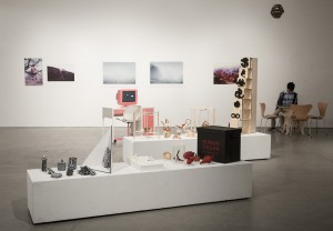
Broad Art Center’s New Wight Gallery has been transformed into an ongoing undergraduate student-run exhibition, “Recess,” which began on January 16and runs through January 30 and is open daily from 10 a.m. to 5 p.m. The event features artwork contributed by Design | Media Arts students who submitted different photographs, sculptures, games and visuals.
Although recess was chosen to be the general theme for the show, the art chosen was based on loose association with the theme, rather than strict interpretation, said one of the curators, Rebecca Rusheen, a third-year Design | Media Arts student. It was also chosen for its skill and aesthetic appeal.
The sculptures, photography and different styles of students’ work represent each artist’s interpretation of the word “recess,” and encourage the audience to make their own interpretation of the word as well.
At the entrance of the exhibition, three photographs entitled “Binary” greet the visitors. In the first picture, brightly colored floating clay shapes frame the face of the artist, UCLA Design | Media Arts student Griffin Libby-Bleser. In another picture, wooden blocks replace the clay shapes. The props used in the portraits are reminiscent of children’s’ toys.
The art on display ranges from innocent to more provocative. The pieces bring about a nostalgic sense of childhood and track the aging process through various interpretations of recess.
Head curator and fourth-year Design | Media Arts student Pauline Woo developed the theme, going back to a time when recess was an exciting break of freedom on a busy school day. Inspired by this carefree time, she incorporated the idea into the theme for her new exhibition.

“Our goal this year is to make (the exhibition) more playful and inviting,” said Woo. “I think the main point is that we wanted something (more enticing) … so that people won’t be scared or intimidated. We wanted to get people to this part of campus who normally wouldn’t be here.”
Woo and other Design | Media Arts students involved in the exhibition, including third-year Design | Media Arts students Laura Beck and Rusheen, worked as a team to choose the art that would be in the show. Beck and Rusheen, both on the exhibition’s branding and marketing team, chose a wide variety of artwork that has never been displayed before.
Beck decided to help after her artwork was shown in an exhibition last year.
Beck and Rusheen design posters for Campus Events Commission. Beck and Rusheen’s contributed pieces, which include the posters they designed for CEC, convey their idea of what recess means to them through their colorful and bright, almost cartoonish images. One poster, designed for a concert for Milo Greene and White Arrows,shows drawings of animals colored in with vibrant colors, which is reminiscent of a coloring book.
However, Beck did not only contribute posters to the exhibition. She also designed the poster for “Recess,” which has a colorfully designed background that is actually a magnified picture of a marble textured bouncy ball.
“We were trying to figure out what kind of images we wanted to photograph to encapsulate this feeling of recess. We decided to do this super abstract picture of this ball because yes, it’s recess, but it’s an abstract form of recess,” Beck said.
Woo, Beck and Rusheen, along with others involved, chose from more than 250 submissions and narrowed it down to less than 100 pieces. The artwork ranges from photographs of landscapes and subdued nude photography to a board game with the objective of harpooning a whale.
Rusheen also made different art for the show, including five disposable photos and a neon, transparent sign that reads “WHAT EVER.” The bright piece reveals the theme of the show through her interpretation of “recess,” which she said made her think of a more fun environment.
“I like to create things that are more approachable to an audience on a multitude of levels,” Rusheen said. “Someone can appreciate it just on an aesthetic level, or just think it’s cool. Or, if they decide to think about it deeper, they can find some meaning there too.“
“It’s kind of fun that we all get to put together everything we’ve been working on in and out of the classroom and show people what we’re capable of,” said Rusheen.
